
Vision
The all-important sense that the majority of us have, but most take for granted.
This article walks you through the role our eyes play as we learn to write—specifically how important they are in helping us to size, place, and proportion everything.
Pre-Writing Shapes
When kids are introduced to writing, like in preschool and kindergarten, they are first taught to create recognizable symbols (pre-writing shapes) such as a circle, cross, or square. This is an important first step, not to be overlooked or abandoned if they don’t get it right away.
Children must first master these developmental shapes prior to being instructed on or required to write letters, gaining the skill and concept of the prewriting shapes.

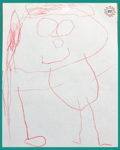
After some foundational shapes are mastered, a child then wants to connect all of those shapes into drawings with meaning and purpose. It may be a picture of themself, their pet, or a favorite stuffed animal.
A child will stay in this phase for quite a while because they start to find success and gain confidence when creating drawings they find most meaningful. However, it will take a while for them to refine their drawing skills.
By repetition and visual feedback, children will begin to make observations about their artistic output. They will start to recognize proportions and whether what they’ve put on the paper is anatomically accurate. For example, the head is often the biggest body part, they realize their legs don’t come out of their head, or they are 3x bigger than their mom or dad.
Name Recognition
Right around 4, even before most formal handwriting curriculum is introduced, kids start recognizing their names; what letter it starts with, how many letters it has, maybe even how to spell it. This requires visual discrimination, visual sequential memory, visuospatial orientation, etc.
Do you notice something all those skills have in common? Yep…again, the eyes.
So, once they recognize their name, they’ll constantly attempt to trace and copy the letters in their name until they are able to autograph all their masterpieces independently.
Sidenote: Parents, when it comes to name writing, I hope you went easy ‘em! No names with 8+ letters…eeek! Or hopefully, you’re willing to let them shorten in for a while!
Cues for Fine Motor Development
Now think about it, children’s fine motor skills are constantly developing; they start and continue to use whole arm movements until something or someone tells them otherwise.
And, using large movements is fine for a while (as it improves core strength and proximal stability), but at some point, they need to start refining those skills.
It will likely happen in 1 of 2 ways. Naturally, the child’s muscles might become tired and therefore instinctually rest it on the table. Or adult tap or gesture them to stabilize it as a means of avoiding the fatigue and encourage the use of smaller muscles.
Why Not Cues for Visual-Motor Development?
If we are willing to provide children with cues to support greater fine motor development, and their eyes are responsible for 80% of the information they take in, why wouldn’t adults try instinctively provide children visual boundaries to minimize the size of their work?
Seems easy enough.
Especially in Kindergarten or 1st grade when the expectation for every worksheet is the same…
“Name on your paper, first thing.”
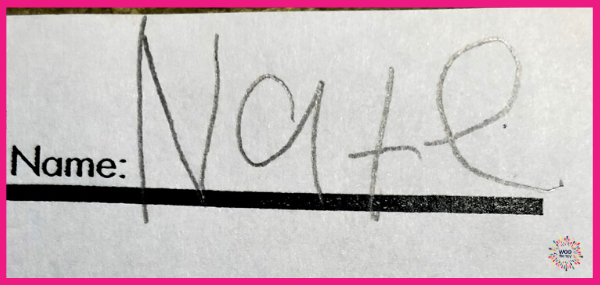
In Kinder/1st these munchkins are still infants when it comes to academic expectations. They need a lot of time to learn, adjust, and adapt to ALL the new sensory inputs in their very busy little worlds. This includes visual inputs.
So, something as simple as writing their name at the top might actually be a huge challenge for them. Something they lack exposure or repetition with so their letters are large, inconsistently sized, with difficulty getting them all on the same line. Or maybe they don’t have directional concepts to know where top and right or corner are.
Wide Open Spaces
(Pardon me while I finish jamming to some ’90s Dixie Chicks)
But in all seriousness, there is an uncanny connection between those lyrics and introductory handwriting. Wide open spaces lead to tons of confusion, frustration, and disappointment.
But in all seriousness, there is an uncanny connection between those lyrics and introductory handwriting. Wide open spaces lead to tons of confusion, frustration, and disappointment.
The lyrics state “she needs room to make her big mistakes”? Wait, what?
For a woman in her 20’s, that’s fine. But for a little 5-year-old, they’ll already be making plenty of mistakes as it is. Does writing jumbo letters because they aren’t given proper boundaries have to be one of them?
No…the answer is most certainly, no! In the case of your child’s visual motor development, less space=less mistakes. Take the guessing and stressing out of the task for them by providing appropriate visual boundaries.
Yes, as humans we learn from making mistakes, but with already so much to learn and understand in a new classroom, let’s cut ’em some slack.
Don’t Leave Them Guessing
Most papers I see, typically provide a baseline, but in my opinion, that is certainly not enough support for 4, 5, or 6-year-old. The eyes need the additional reference of the headline and midline to help them hone in on proper sizing as well as the proportions.
Simply show them WHERE you want them to write and HOW big it needs to be.
Just in this name writing example, there are several simple and effective solutions for visual boundaries. These could truly make all the difference in your child’s success.
1. Provide a large box – this will minimize sizing
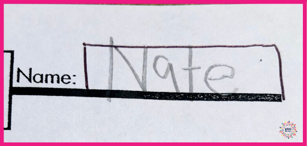
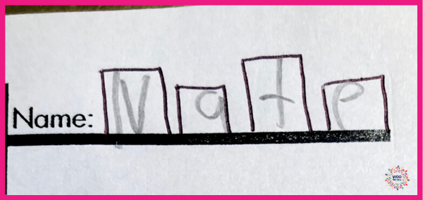
2. Provide individual letterboxes – this will support spatial organization
3. Provide highlighter of their name for them to trace – this can help letter recall, formation, sizing, and placement
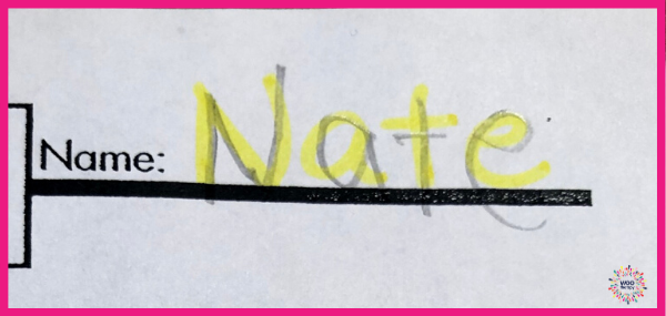
4. Provide WooTape – this addresses the difficulty with sizing by providing a headline, proportions by providing a midline, and placement/alignment by providing a colored baseline.
**Teachers…this is super handy and recommended to do BEFORE making your photocopies!! But obviously color won’t come through…
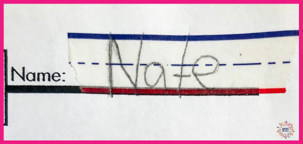
5. Provide any combination of these to address the child’s individual needs
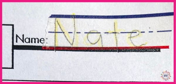
These strategies could be used in isolation or in combination such as highlighting their name on the WooTape. That would help them identify their letter proportions in relation to the headline, midline, and baseline.
Wait until they what?
I despise the “wait until they fail” model when it comes to this because we all know early intervention is crucial.
But guess what? The “early intervention” in this case, is a simple and easy accommodation that any intelligent and willing adult can implement to support their child.
A box or individual boxes for each letter could quickly and effectively address sizing, placement or horizontal spatial relation issues.
Check out this before/after of my son writing the 26 letters of the alphabet on a blank piece of paper versus one providing visual boundaries. (Note: he is 4 with no formal instruction on letter formation) This comparison is strictly for reference on the feedback his visual system receives from having visual boundaries.
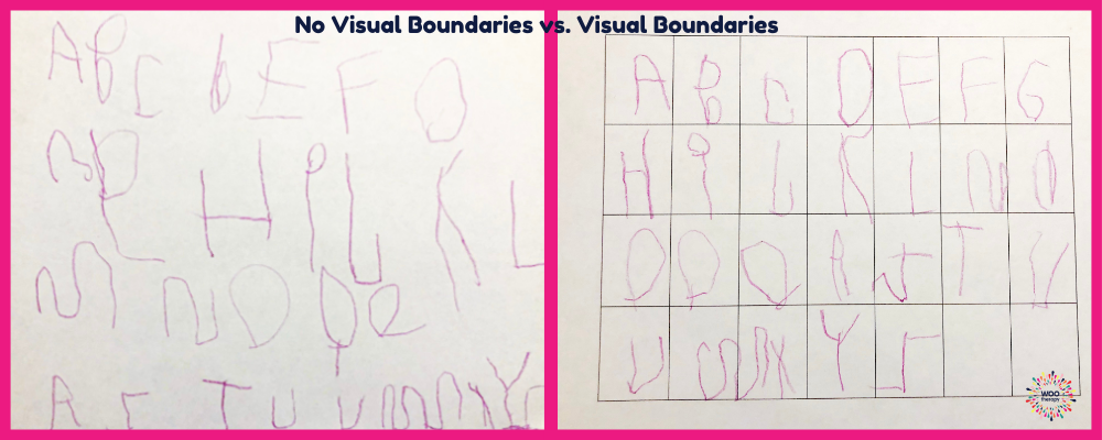
Providing the visual boundaries little eyes need just takes a little common sense and minimal amounts of time. As the handwriting matures, the cues can and should be adjusted accordingly.
At the end of the day, it’s our duty as parents and educators to support kids as they learn and develop new skills. These are just a few examples but the next time you feel frustrated about a child’s sizing, placement, or proportions evaluate yourself and see if you could have helped them improve their skills by giving them those additional visual boundaries.
If you’re interested in finding out more about WooTape and why it’s proven to be so beneficial for children while easing teacher and parent frustrations, head over to I Scream, You Scream, We All Scream For…WooTape. There I answer 7 of the most common questions people ask about WooTape.


Leave a Reply